
HOTEL POSTCARDS | With love from Passalacqua, Lake Como.
- Dec 10, 2025
- 4 min read
Updated: Dec 10, 2025
An artistic reflection of Passalacqua’s glamour and stillness, transforming the villa’s timeless character into an illustration of pure summer reverie.


As part of my Hotel Postcards Collection, this illustration is inspired by Passalacqua’s quiet cinematic beauty, a villa where emerald gardens, lakeside light, and old-world glamour come together in a world entirely its own.
If you’re very fond of beautiful living and the kind of travel that stirs something in your spirit, Passalacqua is a place you simply must see. It has this wonderful way of hiding in plain sight. When you’re gliding across the lake by boat, it’s almost too easy to miss... which feels perfectly Italian, really. All the best places here prefer to stay a little concealed, revealing themselves only to those who linger long enough to notice.
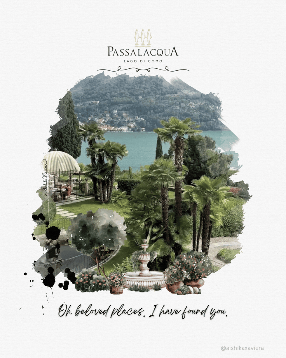
What captivated me most was the way the property unfolds. Every turn offers a fresh composition, a new mood, a completely different perspective , as though the villa has curated its own sequence of scenes. There’s a suite grander than most Milanese apartments I’ve seen, yet the true beauty lies in the quiet corners: the ring of magnolia trees by the rose garden where the morning light feels almost spiritual, or the small, secluded jetty where the world narrows to water, breath, and stillness.
The entire estate felt like a painting already in motion, waiting for someone to translate it.
And so I did.
The vision behind my Passalacqua, Lake Como illustration.
The pool terrace. A maximalist magical world on the shores of Lake Como. Passalacqua’s umbrellas are practically icons, those playful green and white canopies with their bespoke, maximalist trim. In person, they feel almost theatrical. The glasshouse beside them glows with a kaleidoscopic palette, and the whole scene becomes this joyful, expressive pocket of colour that feels at once nostalgic and entirely new. Standing there, I understood why people say the property has a bit of magic to it. It does. And it set the scene for my illustration.

A colour story: When I met Phthalo Green
Every illustration begins with a dominant hue, the anchor everything else leans against. In most of my work, that anchor is my beloved black. But at Passalacqua, the colour that kept following me wasn’t it. It was a deep green I kept running into everywhere I looked: in the manicured gardens, in the mirrored lake, in the way the umbrellas cast their shadows, and in the towering pines rising behind the villa.
It was a green so rich it felt almost impossible. Not emerald. Not forest. Something deeper, cooler, more mysterious.

Back in my studio, once I started mixing inks, it became obvious: the colour I was chasing was Phthalo Green (#123524).
A cool, blue-leaning green, famous among painters for its intensity, beloved among dreamers for its mystery.
Once I named it, everything else made sense. The colour story of my moodboard came alive.

The velvet hush of the gardens.
The green couture gowns pinned to my moodboard.
A vintage Aston Martin Paul once pointed out to me, its finish almost identical to the umbrellas.
The lake shifting through tones of jade and phthalo.
The boats swaying like brushstrokes.
Emerald eyeshadow palettes that feel cinematic.
Sculpted hedges.
The tall Como pines framing the water.
All of these threads, elegant, quiet, atmospheric, wove themselves into the palette of my illustration.
The muse. Woman under the green umbrella.

Every illustration in my Hotel Postcards series begins with a muse, though she never introduces herself outright. She arrives in gestures, in the tilt of a shoulder, in the quiet mood of a moment rather than the face of a person. At Passalacqua, the woman sitting under the green umbrella was, me.
It was the eve of our tenth wedding anniversary, and there was something about the air that evening. Everything felt a little cinematic. Not dramatic or staged, just gently heightened, as though Paul and I had wandered into the opening sequence of our own romantic film and no one had called “cut.”
It wasn’t a character I invented. It was the version of myself that existed only in that moment. Calm, elegant, a little reflective, softened by emerald light and ten years of love.
I became the muse because, for one quiet evening at Passalacqua, I felt like someone worth capturing.
A tribute.

Illustrating this place felt different. Somewhere between the folds of the umbrella, the quiet geometry of the pool chairs, and the shimmer reflected back from the lake, I realised I wasn’t just recreating a scene. I was honouring a story that began centuries ago.
Count Andrea Lucini Passalacqua built this villa in 1787 with a single intention: to host the great minds of culture, music, and artistry. For over two hundred and fifty years, its guests have included Napoleon, Churchill, and Bellini himself, who lived here while composing two of his operas. The guestrooms now carry the names of the women he wrote into song.
Perhaps it’s no surprise that as I painted, I felt part of a lineage of dreamers. Another quiet artist passing through, adding one more interpretation to a place that has inspired so many before me.
With love, from Passalacqua. xoxo
Passalacqua Lake Como is part of a larger vision, my Hotel Postcards Collection. Each illustration in this series is inspired by a luxury hotel or destination, offering a visual memento of places that resonate with both travellers and art lovers. From the emerald stillness of Passalacqua to the other equally timeless escapes I've illustrated, my goal is to transport you into the elegance and allure of these locales, even when you're miles away.
Share this illustration with a Lake Como lover, a stylish friend, or anyone who finds joy in quiet, beautiful corners of the world.
SHOP the Passalacqua Lake Como fine art print.
Viva la dolce! 🥂⛲️🌳


Comments